
The government’s approach to addressing the spread of COVID-19 in Australia has been subject to much debate with relatively equal amounts of criticism and praise. It would appear at this stage that we will come out of this pandemic much better off from a health perspective than most countries. But is that by good management or just good luck in being a remote and sparsely populated country.
Up until now there has been plenty of analysis and visualisations of how the infection has spread, the number and locations of deaths, and where are the most vulnerable communities. However, there has been very little statistical information available, supported by data, of what might have happened had we not locked down businesses and imposed isolation. Well now there is!
Using advanced Artificial Intelligence, including Unsupervised Deep Learning, Mapcite have processed and visualised available data under a predictive modelling scenario. This is not the first time Mapcite have done this, having previously undertaken work in predicting the spread of H1N1 in North America. The current results for COVID-19 in Australia are quite enlightening and support the approach the government has taken, as can be seen from the herein image extracts from the model.
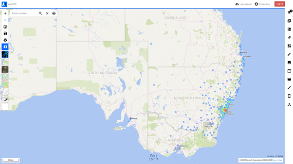
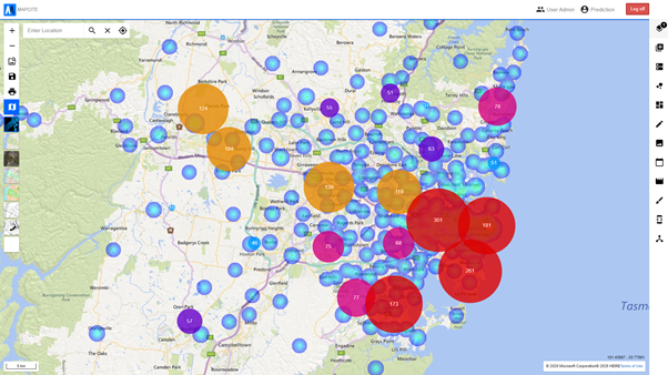
For any predictive modelling to be accurate, the larger the historical numbers and patterns, the better is the resultant prediction. In the case of COVID-19, the history and numbers are not large therefore the result is an estimate, albeit one which has statistical validity. As time goes on and more data is gathered about COVID-19 infections and spread, the results will become much more accurate for future predictions. The first image below represents all the COVID-19 cases reported across greater Sydney from late January up until 5 May 2020. As can be seen from the heat map, the numbers are concentrated in various specific areas and in fact total some 2,000+.
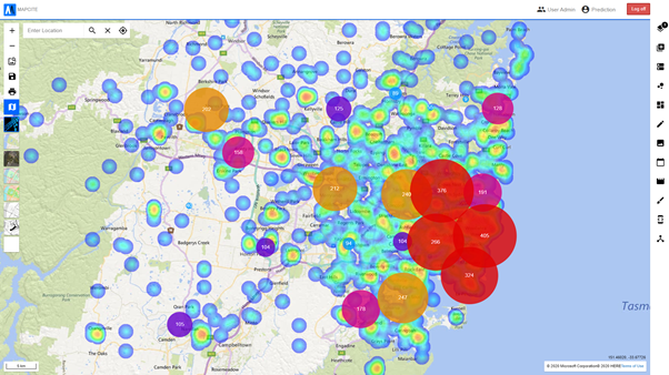
By contrast, the second image as below is what was predicted by the Mapcite AI predictive modelling engine by 5 May, had there been no lock-downs or isolation policies imposed, as was done from late March. It is very clear from this image that the numbers of infections are much higher, and analysis shows that they are to the order of 2x — 5x depending on the specific date ranges and localities selected. Given that the time period to 5 May is quite short, these numbers are quite staggering and would have resulted in a correspondingly higher death count. From 5 May on, those predicted infection numbers would logically have geometrically increased.
These comparative numbers and visualisations must give some comfort to those wondering whether the timing and degree of isolation and social distancing enforcement was effective in restricting the spread of COVID-19. They are also a useful guide to addressing further outbreaks.
Epidemiological Transparency
Independent data analysis, like the predictive modelling prepared by Mapcite, provides a level of independent scrutiny. Such third-party models empower organisations and managers to obtain a ‘second opinion’, which can be vital in preparing recommendations, plans and resource allocations.
As an advocate of informed planning, Mapcite knows that good information feeds good decisions. Globally, COVID-19 projections vary considerably. That’s because outcomes from a single epidemiological model describe a range of possibilities which are sensitive to human actions. In short, don’t believe the first COVID-19 model you see. Take an informed approach.
The danger of relying heavily on one model is it could be wrong, overly optimistic or excessively pessimistic, as has been reported in various recent articles around the world, including:
Infectious disease outbreaks recapitulate biology: they emerge from the multi-level interaction of hosts, pathogens and environment. A recent paper published by researchers Samuel Scarpino and Giovanni Petri, entitled, On The Predictability of Infectious Disease Outbreaks, shows that outbreak forecasting requires an integrative approach to modelling. This is something Mapcite is equipped to offer.
Another paper published by researchers Gerardo Chowell, Lisa Sattenspiel, Shweta Bansal and Cecile Vibound, entitled, Mathematical Models to Characterise Early Epidemic Growth: A Review, explores the long tradition of using models to generate insights into the transmission dynamics of infectious diseases to assess the potential impact of different intervention strategies. The rising use of models for epidemic forecasting highlights the importance of designing reliable models that capture baseline transmission characteristics of specific pathogens and social contexts. Operating as a domain expert in the space, Ian Haynes, founder of Mapcite, understands the nuances of model design intricately.
Similar models have also been developed for Australia, like the one from Associate Professor Ben Phillips, University of Melbourne, as reported in his recent post, Modelling the Spread of COVID-19.
What Ian’s work shows is that these comparative numbers and visualisations must give some comfort to those wondering whether the timing and degree of isolation and social distancing enforcement was effective in restricting the spread of COVID-19. They are also a useful guide to addressing further outbreaks.
Author: Stephen Walker, GM Centre of Excellence for Geospatial in Australia
Editor: Claude Drulik, Marketing & Communications Manager, Mapcite