
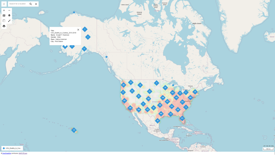
In the interactive digital map published here, you will find a view by location of recorded deaths at the hands of police from 2013 to 2019 in the USA. Whilst we make no comment on the justification, or reasons for the racial, social, or cultural predominance, it is of interest to examine the occurrences across the country. This is especially significant in the light of the recent Black Deaths Matter movement.
The map can be examined by drilling down into specific regions and incidents, both by individual locations and by a heat map of varying intensities. The underlying individual incident data can be seen by clicking on any pin as shown in the above image. The overall data showing various analysis and statistics can be found at https://mappingpoliceviolence.org/.
To quote some of those statistics:
- Black people have been 28% of those killed by police since 2013 despite being only 13% of the population.
- There were only 27 days in 2019 when police did not kill someone.
- Where you live matters, with some areas of the US up to 6 times more likely to be killed by police than others.
- Levels of violent crime in US cities do not determine rates of police violence as there is no correlation apparent between those two data sets.
The ability to produce an interactive map and then share that with anybody via a public URL is one of the innovative capabilities of the Mapcite geospatial data analytics platform. All this is done within Excel by everyday business users; you don’t need to be a data scientist! In fact, as per the image below, the receiver of the map can “fence” any region and download to Excel the details of every incident in that area including name, age, gender, race, cause of death, and city. Try it for yourself.
Further information on the Mapcite Excel Publisher feature and other data examples can be found here.